brand
Corner Chicken
credit
photos courtesy of:
Alternative Strategies
Eater SD
when
2020
scope
Branding Collateral
Menu Design
brief
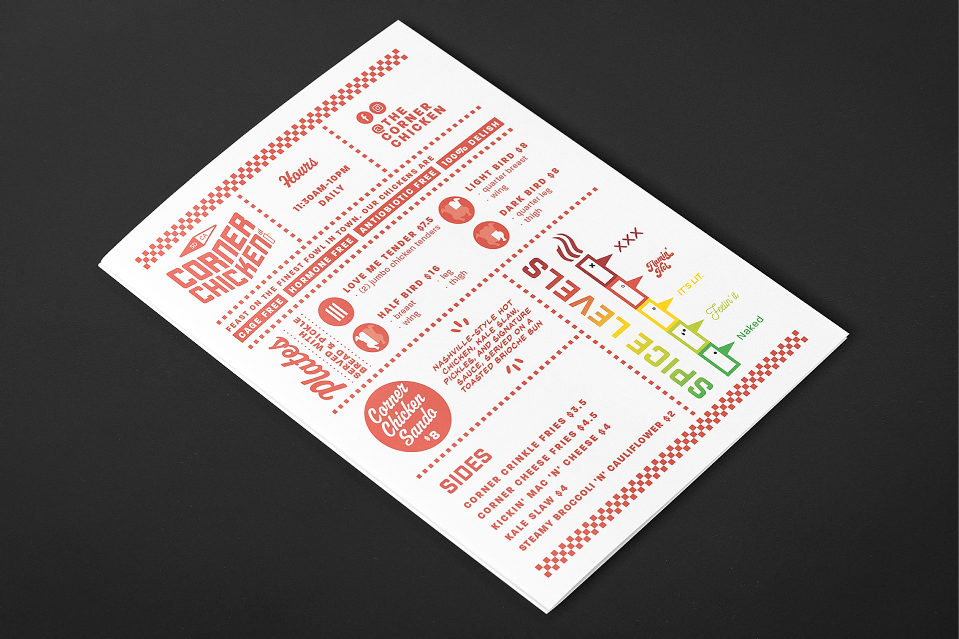
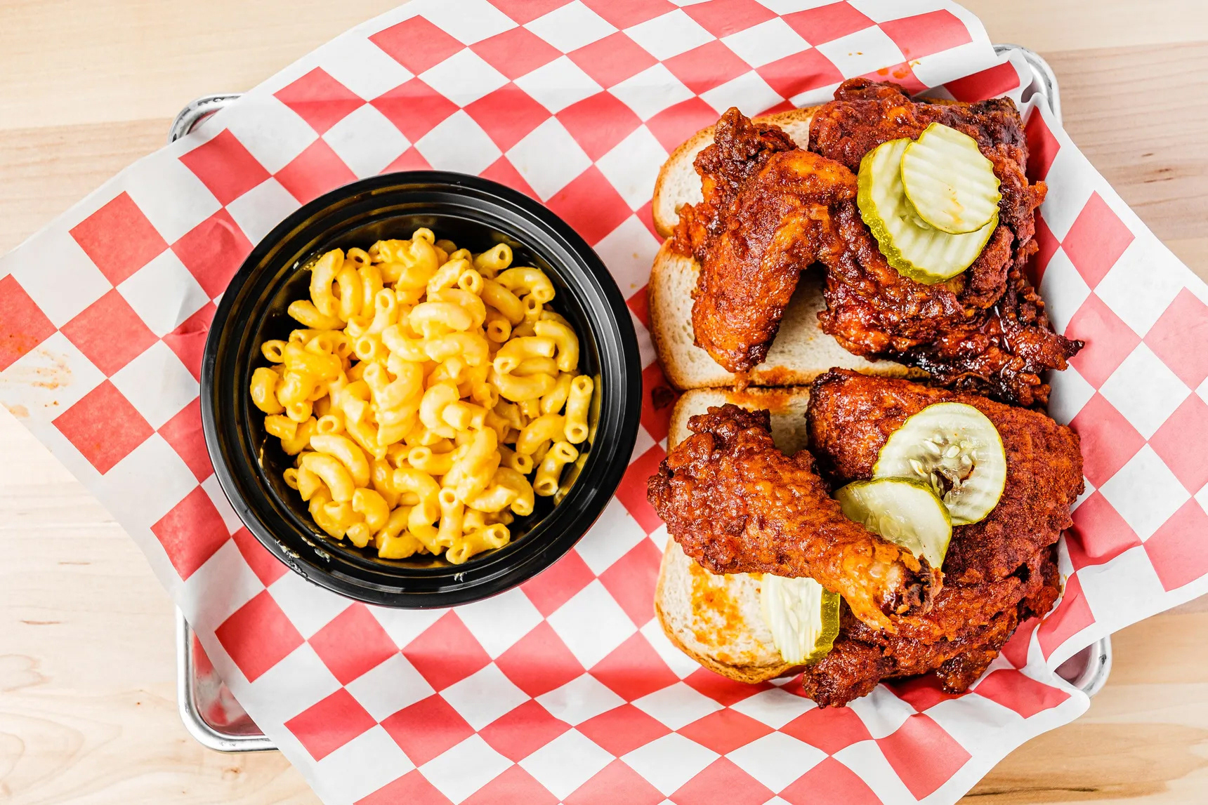
We were approached by existing client, Tajima, to help them with a new concept that was yet to be named. They would be serving up Nashville-style hot chicken sandwiches & plates accompanied by your favorite homestyle sides. The hot chicken would be natural, cage-free, antibiotic-free, and (optionally) paired with your favorite beer. The space would be perched at the corner of Ninth and G Street.
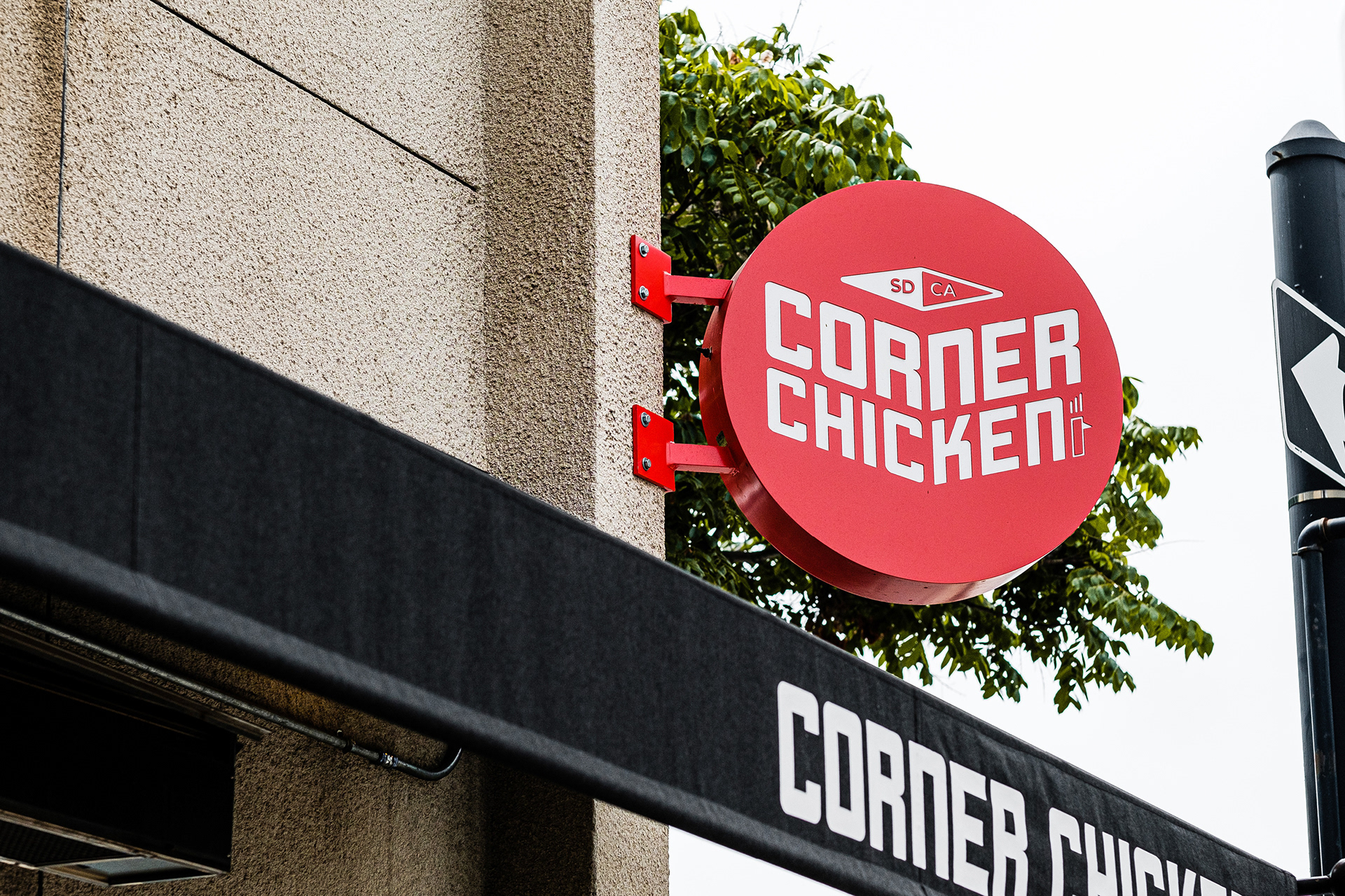

our role
Our team was first tasked with naming the concept: the client went with ‘Corner Chicken’—simple like their menu and it played off the location of the restaurant. The next step was to design the logo and the rest of the branding elements would fall into place.
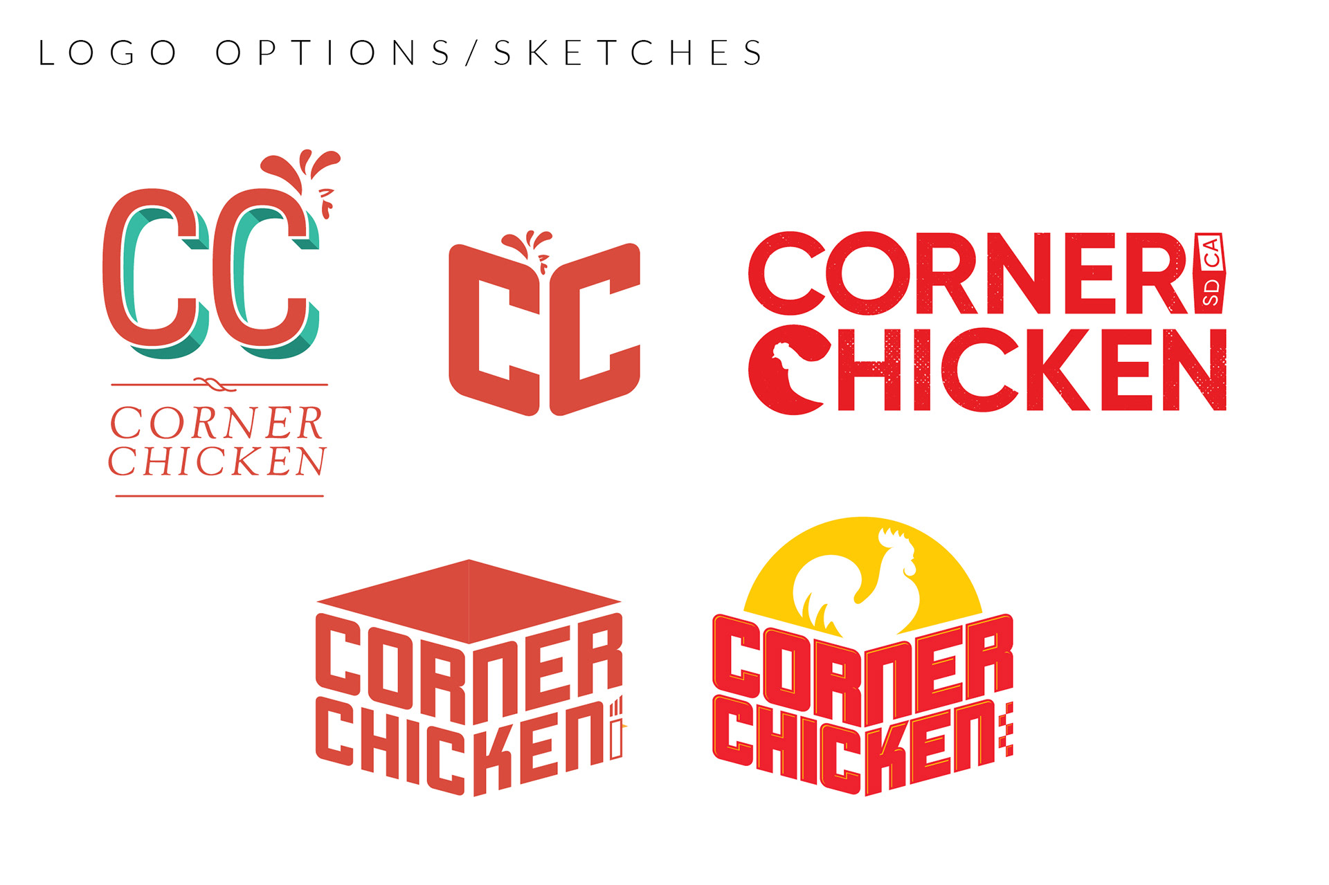
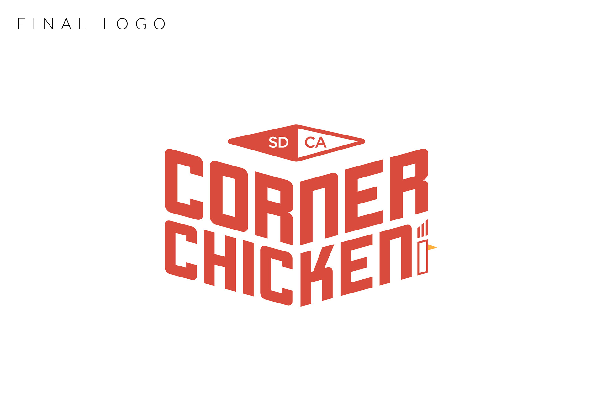
the logo
I knew I wanted to play off the "corner" concept some more and the best way to do that was creating a design using perspective. My second box to check was to keep the logo simple but bold/clear because the client would need to use it on apparel, business cards, flyers, among many other things. The last box to check was to include some kind of chicken symbol for obvious reasons.
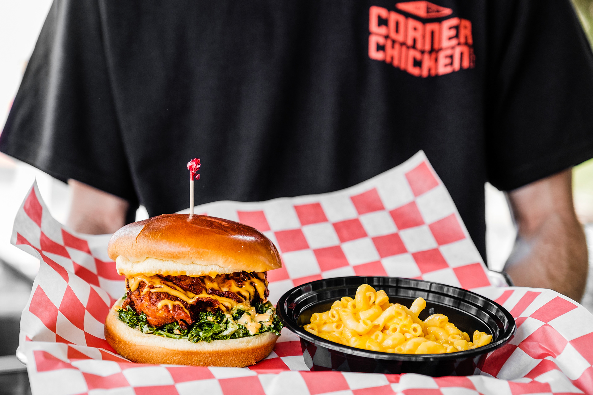
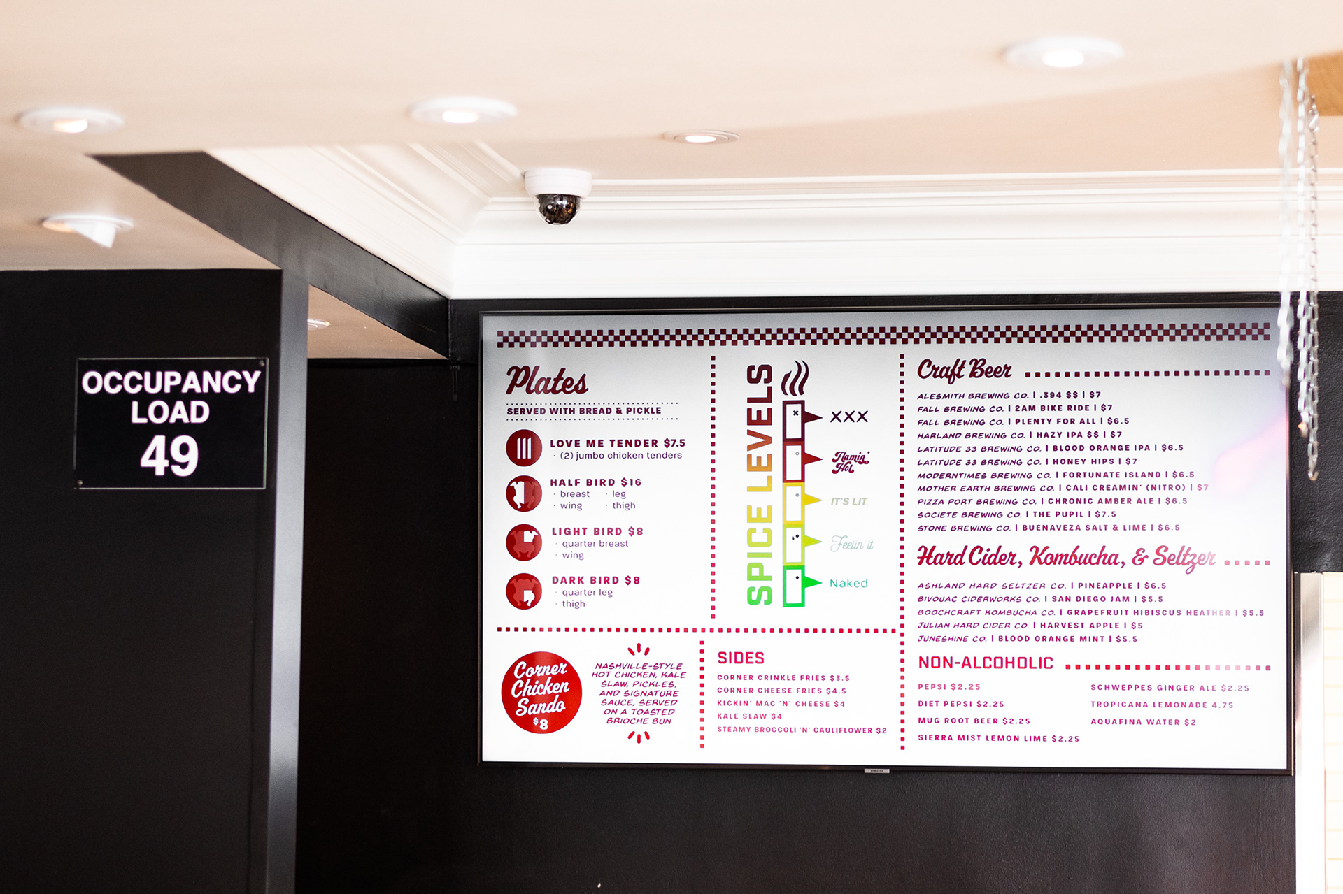
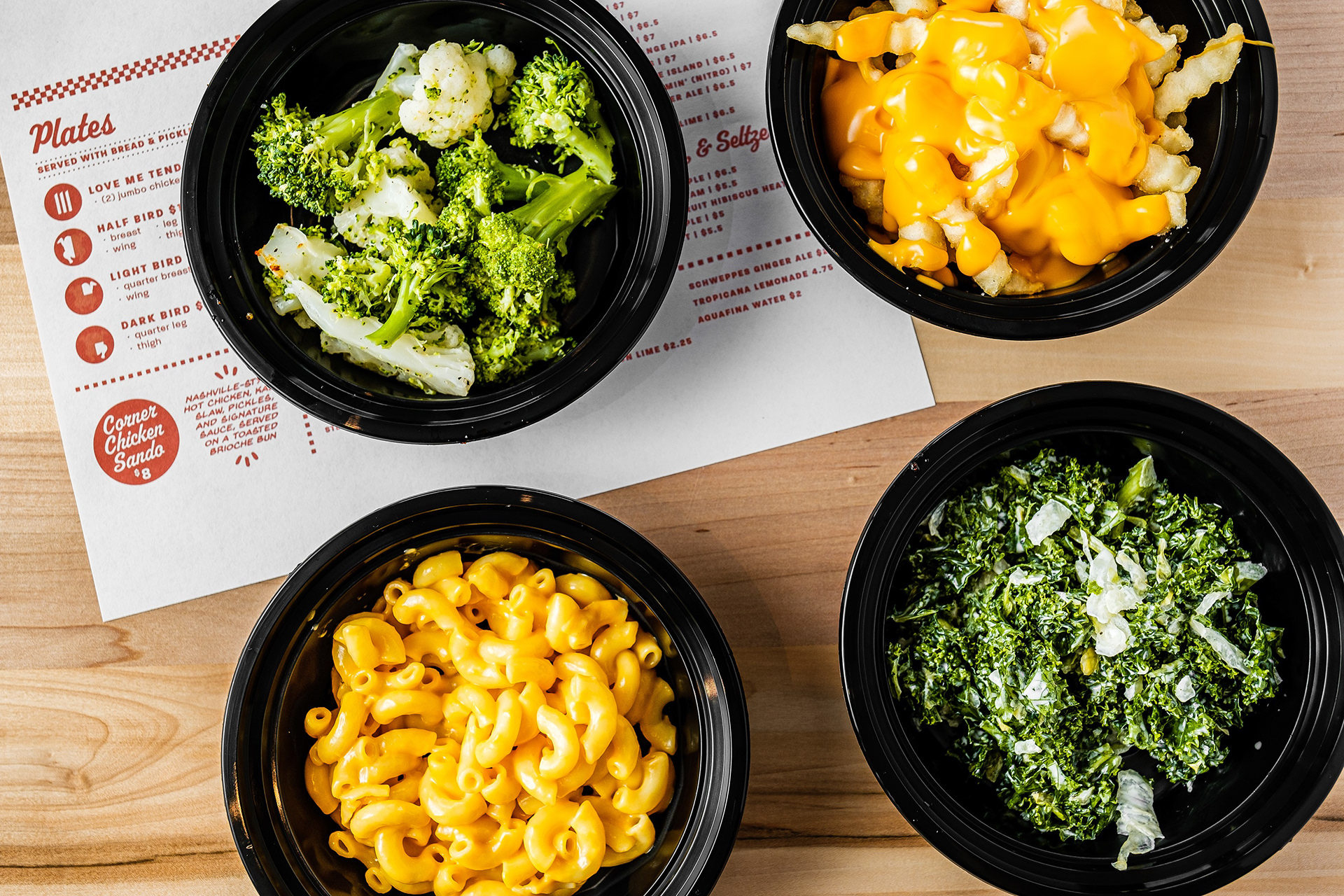
the menu
In my designer opinion, the menu should complement the cuisine so that is what I tried to do. We all recognize the red-checkered paper liners that line food baskets; it represents casual comfort food so naturally, I had to incorporate this into Corner Chicken’s branding. My main goal was to incorporate fun elements while keeping the design modern, yet nostalgic.