brand
Como Ceviche!
when
2016
scope
Restaurant Naming
Logo Design
Branding Collateral
Poster Design
brief
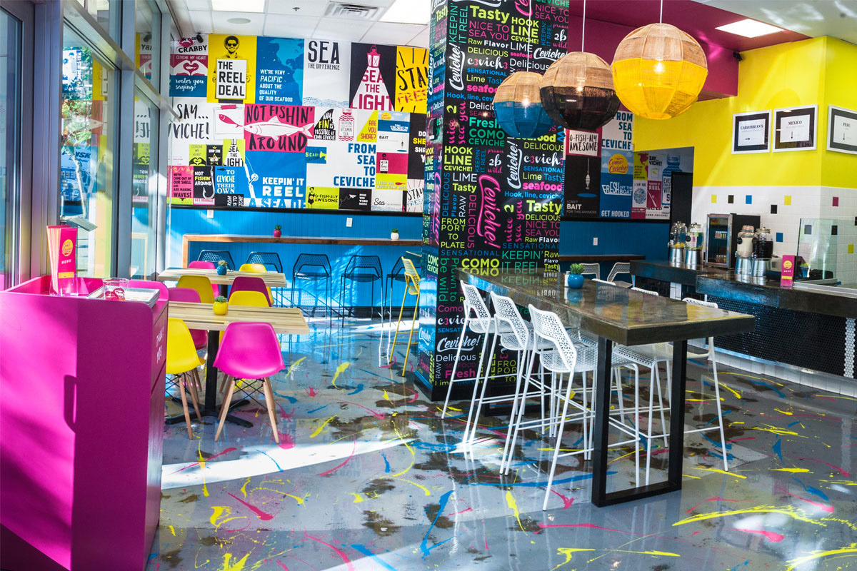
Como Ceviche! was the lovechild of good friends Johan Engman (owner of Rise + Shine Restaurant Group) and William Lopez (principal of Alternative Strategies). The two long-time business partners and travel gurus got together to bring fast-casual ceviche to East Village, San Diego—think Chipotle but for ceviche! Flavors of your bowl, wrap, or plate ranged from Peruvian to Caribbean. While CC! did not last as long as we’d hoped, I will always have a soft spot for this project because I'd been with it since its conception.
my role
Having my boss as one of the owners of Como Ceviche! held me very close to this entire project. Our team was involved in submitting name suggestions, where ultimately one of mine was chosen. From there, the design team submitted logo options in which, one of mine was again, chosen. As a result, I led the art direction of all things design for CC!.
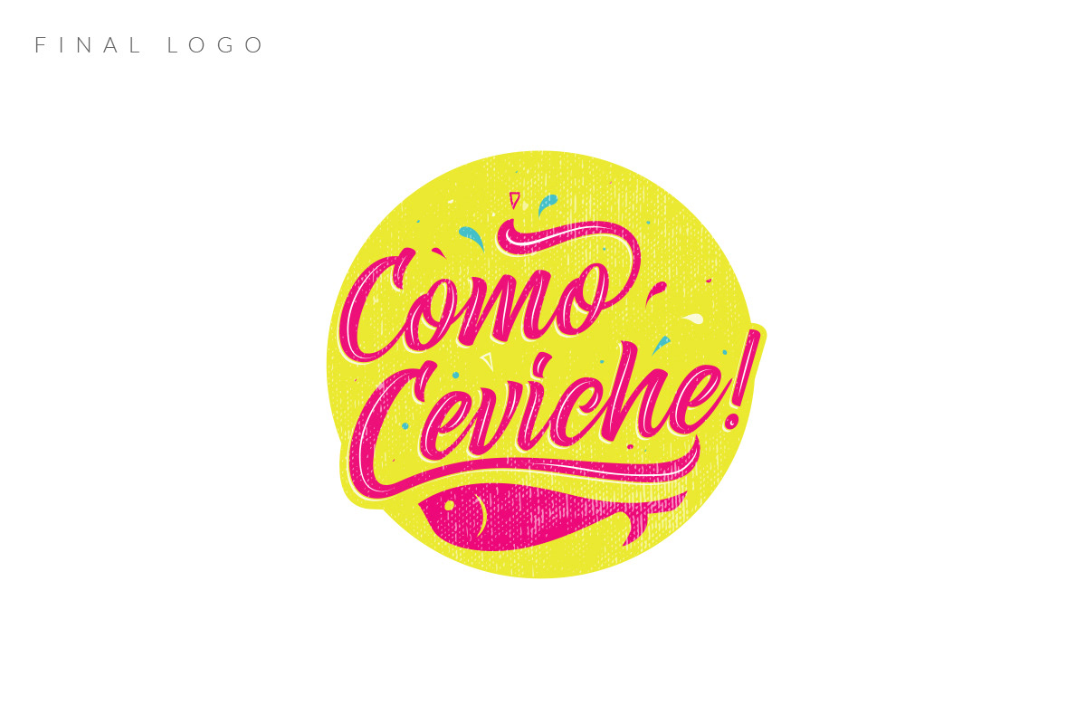
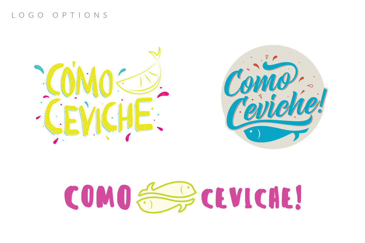
the logo
We were provided a bright, almost neon, color palette and were advised to make our designs festive and energetic. I channeled my inner ceviche-lover and decided that I needed to use handwritten-type or cursive fonts. I believed that they would provide the “motion” and action the logo needed. Latin culture is very vibrant and lively so I wanted to make sure this came through. I added textures and accents to give the logo a more casual feel.
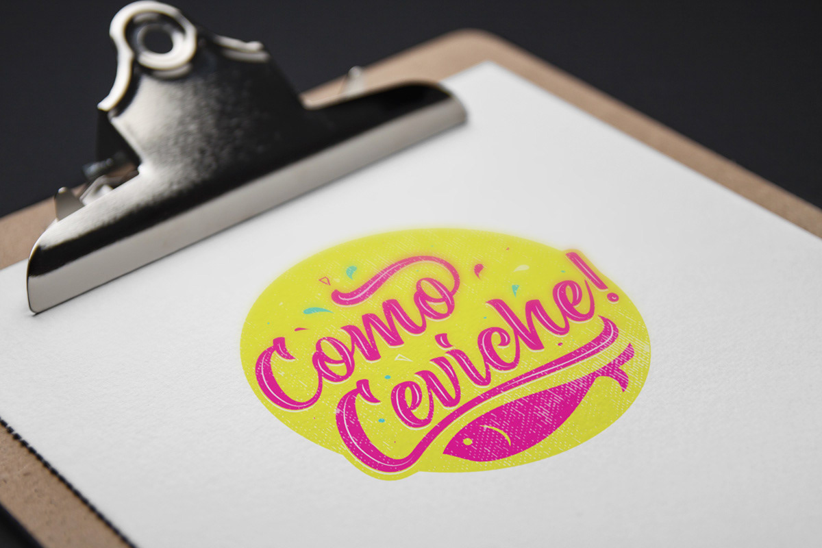
the result
The logo version we went with contains a cursive font with plenty of alternates (for that extra flare!) and bright contrasting colors. I added accents of varying shapes and sizes to bring more movement and fun and lastly, I added distress over everything because it reminds me of a stamp or paper bag, things you associate with casual dining.
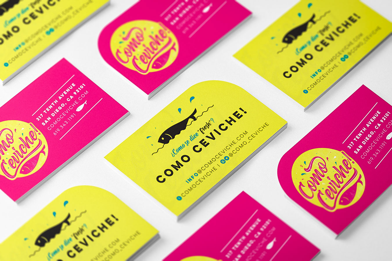
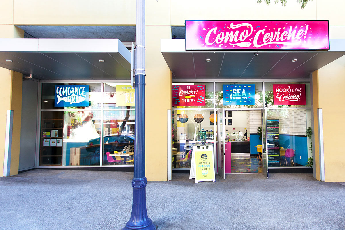
I wanted to complement the fluid design of the logo with clean, sans serif fonts in other branding materials. One of the biggest projects for the Como Ceviche! space was to create an entire wall full of unique posters. Our team worked together to come up with 50+ unique posters–mixing serif and sans serif fonts, simple vs intricate designs, type-based vs image-based–to bring together this space that could be described as organized chaos.