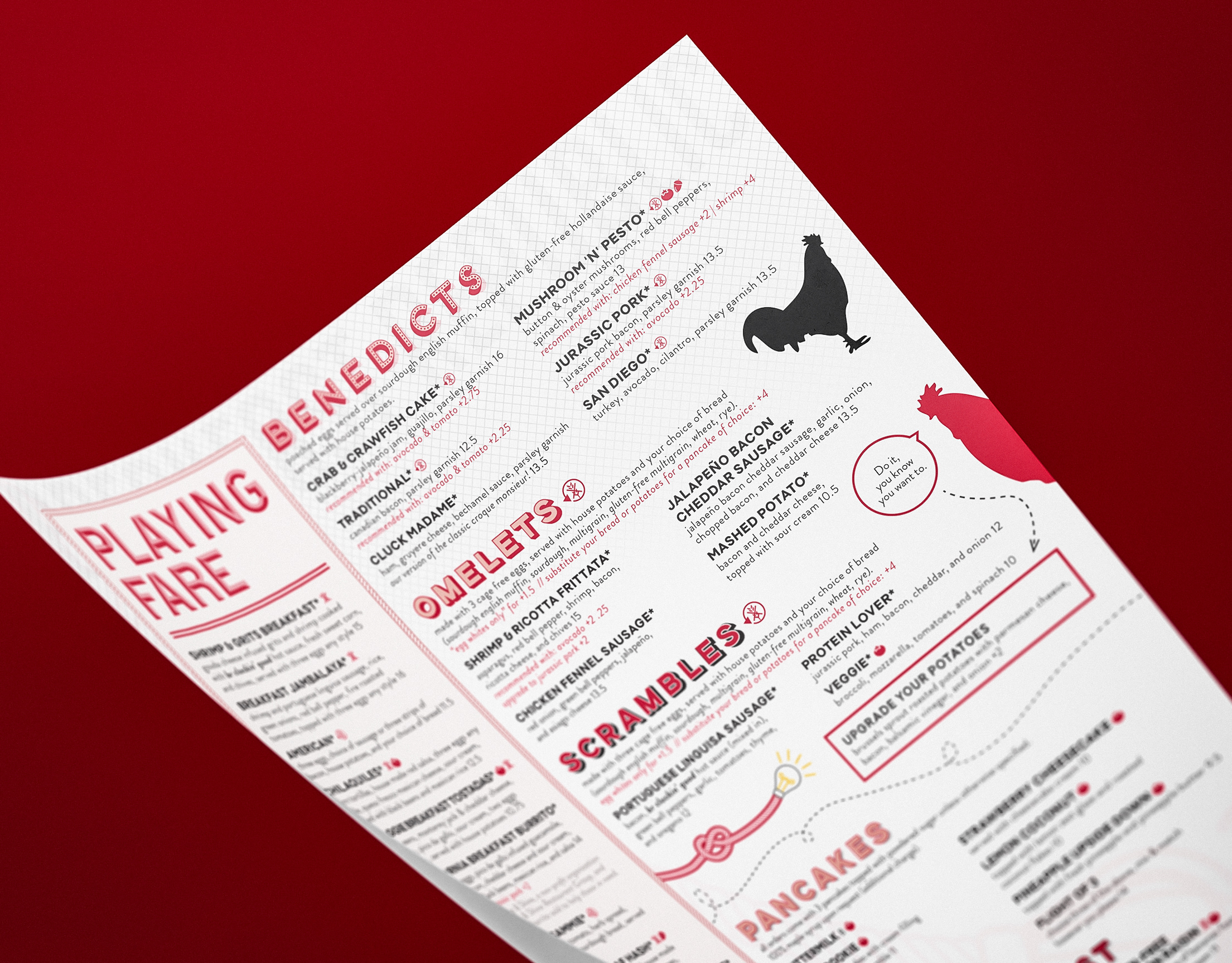
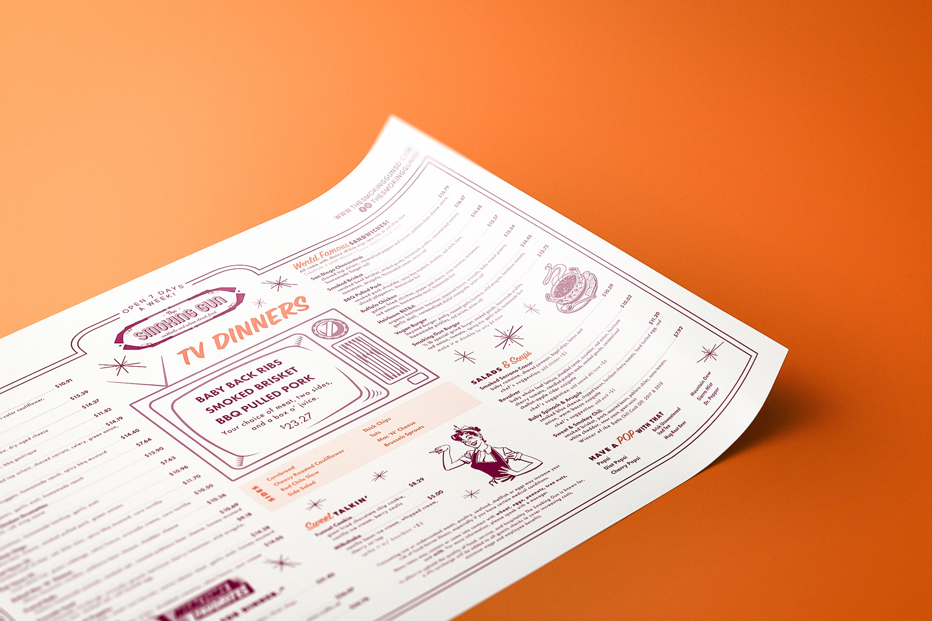
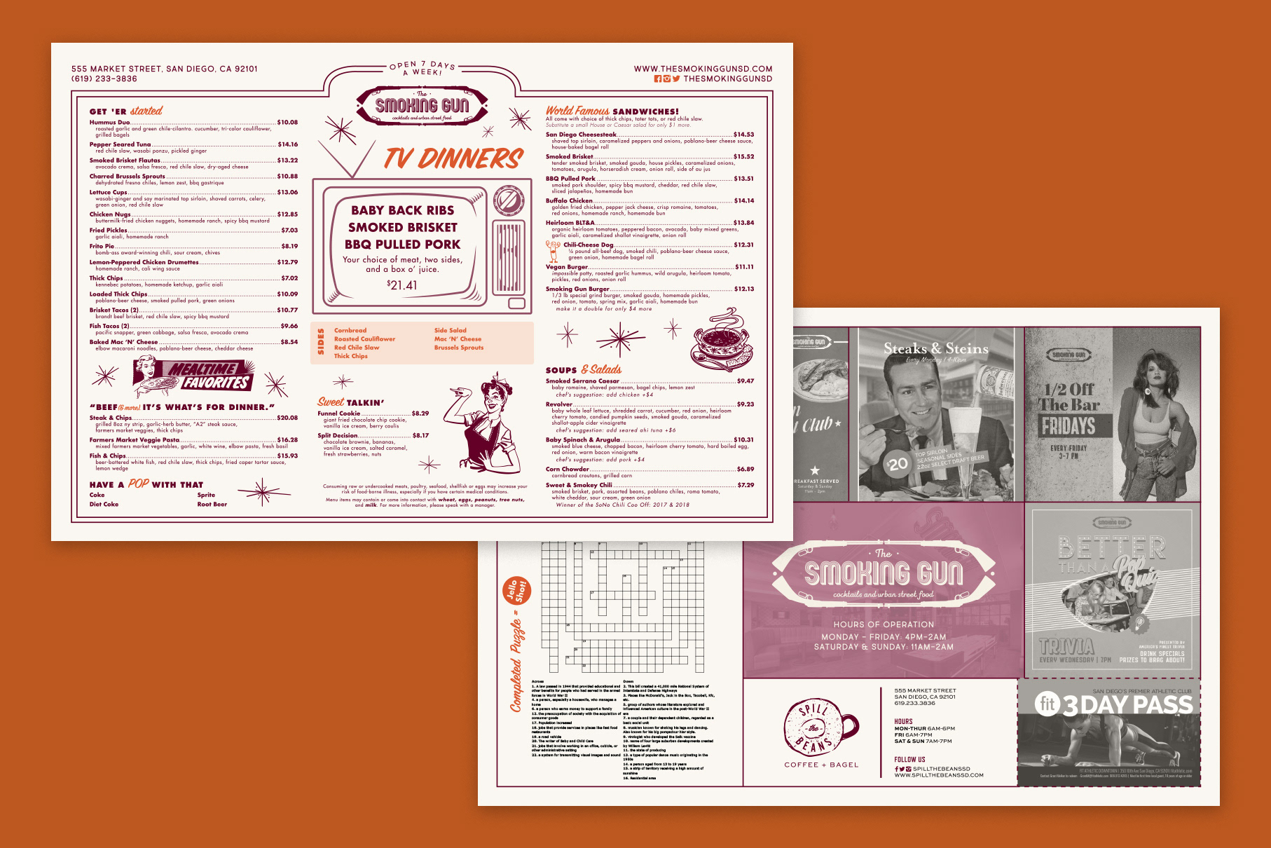
the smoking gun
The goal for The Smoking Gun menu was to bring a sense of nostalgia to their brand. These menus were printed on thin paper in order to give off that diner placemat feel.

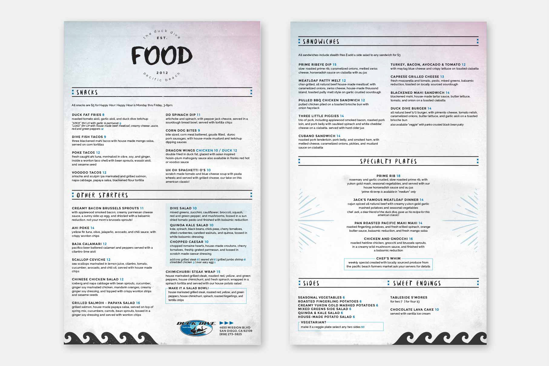
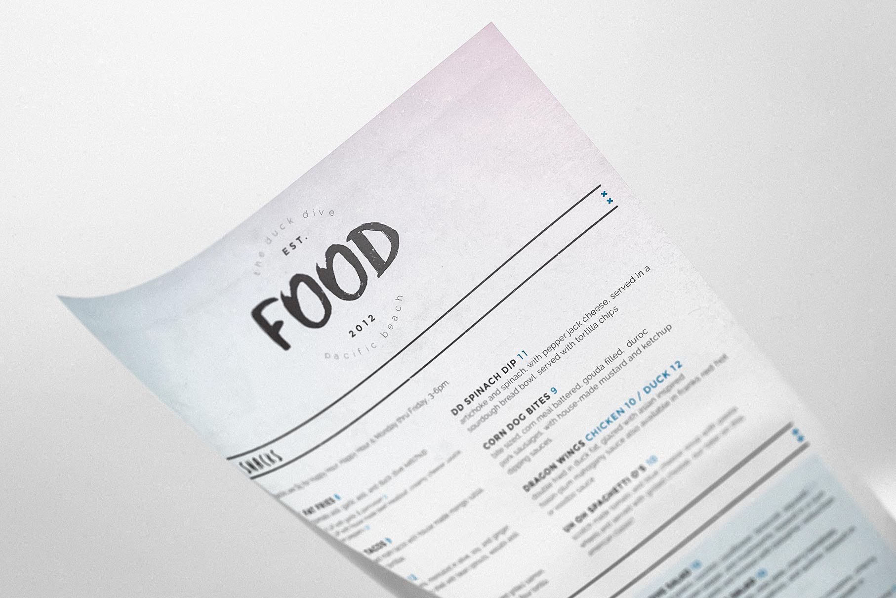
duck dive
With a brand that was already established, these menus were created following existing guidelines which included beach-y grunge elements. I used a handwritten brush font contrasted with a clean serif along with layered textures to create this feel.
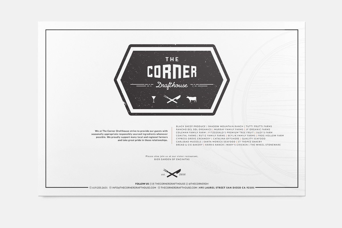
the corner drafthouse
With our team working to develop a brand for this newly opened establishment, there was a little bit of creative freedom allowed here. I aimed to create a look that was a balance between classic yet modern and bold.